
Let’s be honest—choosing kitchen colour schemes can feel overwhelming. You’re staring at paint swatches, Pinterest boards, and design blogs, wondering what works in real life. Should you wear classic white, bold black, soft sage, or terracotta tones? I’ve been there. After refreshing my kitchen last spring, I quickly realised how much a thoughtful colour palette can change the whole mood of a space.
Whether renovating or just itching to freshen things up with a lick of paint and a few new pieces, this guide is for you. I’ve put together my favourite kitchen colour schemes that look beautiful and feel like home. You won’t find buzzwords or overly staged showrooms here—just honest, tried-and-true ideas that you can use.
Why Kitchen Colour Schemes Matter
Before we discuss the ideas, let’s review the basics. Why do colour schemes matter in the kitchen?
Your kitchen isn’t just where you cook—conversations happen over a cuppa, where your kids finish homework, where you sneak that midnight snack. It’s the heart of your home. And the colours you choose set the tone.
Here’s what a great kitchen colour scheme can do:
· Make a small space feel bigger or brighter
· Add warmth and comfort
· Highlight your cabinetry or splashback
· Tie in your appliances and hardware
· Reflect on your personality and lifestyle
Common Questions About Kitchen Colour Schemes
I get asked these all the time—so let’s tackle them:
“Can I mix more than two colours in my kitchen?”
Yes! Layering colours gives your kitchen depth. Just keep one main tone and add two supporting ones in smaller doses.
“Do darker colours make my kitchen look smaller?”
Not always. Dark colours can create a cosy, elegant feel. It’s all about balance—pair dark cabinets with light walls or splashbacks to avoid making the space feel closed in.
“Is white still in style?”
Absolutely. White is timeless. But pairing it with natural textures or a pop of colour makes it feel modern rather than sterile.
1. White, Wood & Warm Neutrals: The Calm Classic
You can’t go wrong with white if you’re drawn to clean, fresh vibes. But instead of going full sterile, blend white cabinetry with warm timber floors, sandy beige accents, and soft lighting.
Why it works:
· White reflects light, making your kitchen feel bigger
· Wooden textures bring warmth and prevent it from feeling cold
· It pairs beautifully with brass or matte black tapware
Add your touch:
· Creamy off-white over stark, bright white
· Rattan stools or cane pendant lights
· Beige-toned stone benchtops or splashbacks
Tip: Use low-sheen finishes for a softer, lived-in feel.
2. Moody Green, Matte Black & Brass: The Bold Look
Want a kitchen that feels like a wine bar meets a luxury retreat? Deep green cabinets with matte black handles and brass taps are striking without being over the top.
Why it works:
· Green brings in that natural, grounded feel
· Matte black adds drama and sophistication
· Brass softens the look with a warm glow
Add your touch:
· Use forest green or olive, depending on how bold you want to go
· Add open shelving in natural oak
· Pair with textured tiles like handmade zellige or herringbone splashbacks
Perfect for older homes with character or anyone after a moody, inviting space.
3. Soft Sage, White & Light Oak: The Fresh Favourite
Sage green has taken off in Aussie homes—and for good reason. It’s calming and playful and pairs beautifully with natural tones. Combine it with crisp white and light oak for a peaceful, Scandi-inspired kitchen.
Why it works:
· Sage is gentle on the eyes and calming
· Light oak warms things up without overwhelming
· White keeps it bright and breezy
Add your touch:
· White quartz benchtops with subtle veining
· Oak handles or floating shelves
· Sage-coloured cabinets or even just a painted island
Works beautifully in both beachy and country-style homes.
4. Navy, White & Gold: The Refined Statement
If you want something a bit more regal, navy is your colour. Deep, inky blue with gold handles or fixtures adds just the right amount of drama without too darkening the space.
Why it works:
· Navy is elegant and versatile
· Gold adds warmth and contrast
· White keeps it from feeling too heavy
Add your touch:
· Use navy only on lower cabinets to ground the space
· Pair with white subway tiles or marble splashbacks
· Add gold tapware or pendant lights
Ideal if you love a classic look with a bit of personality.
5. Terracotta, Cream & Charcoal: The Earthy Blend
Terracotta tones are making a huge comeback for a grounded, welcoming feel. They remind me of warm Aussie summers, clay pots, and sun-soaked patios. Paired with soft cream and grounding charcoal, this colour combo feels rustic but modern.
Why it works:
· Terracotta brings a touch of the outdoors in
· Cream softens the warmth
· Charcoal anchors the space with depth
Add your touch:
· Clay or burnt orange tiles
· Cream cabinetry or walls
· Matte charcoal handles or tapware
Beautiful open-plan kitchens that blend into dining and outdoor areas.
Quick Tips for Choosing Your Kitchen Colour Scheme
Still unsure what works for you? Here’s what I always keep in mind:
1. Consider Your Lighting
Natural light can make colours look different. Test paint samples on your walls and see how they change from morning to evening.
2. Think About the Rest of Your Home
Your kitchen doesn’t need to match your living room, but it should flow. Look at the materials and tones used nearby and incorporate some of that.
3. Don’t Forget the Details
Handles, lights, stools—these little touches combine your colour scheme. Choose finishes that either match or intentionally contrast.
4. Sample First
Buy sample pots and paint them on large cardboard pieces. Move them around the kitchen to see how they appear in different lights and locations.
5. Trust Your Gut
Trends come and go, but your kitchen should reflect you. Choose colours that make you smile every time you walk in.
Inspiration You Can See
Add visual references wherever you can. Here’s what I suggest for a quick visual boost:
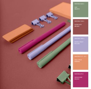
· Moodboard image: Include a flat lay of paint chips, timber samples, and tiles
· Before-and-after video: Share a short reel of your kitchen refresh
· Infographic: “5 Colour Schemes That Always Work” – something simple and scannable
· Alt text: Be descriptive, e.g., “Sage green kitchen cabinets with oak floating shelves and white benchtop.”
Let’s Talk!
What colour scheme are you loving at the moment? Have you tried something bold, or do you stick to neutrals? Drop your thoughts in the comments—I’d love to hear what’s worked for you (and what hasn’t).
And if this helped you or sparked some ideas, go ahead and share it with a friend who’s been itching to refresh their kitchen, too. Sometimes, it takes a little inspiration and a dash of courage.
